The Task
The client uses unsplash to load images into their gallery page. They are currently getting a lot of complaints which is resulting to a high bounce rate on the page. When the client checked, they noticed that there pages are loading really really slow. After a consultation, the consultant noticed that the previous developers were loading in the original sized images for the page. Our job is to use a combination of best practice and unsplash api to make the page faster.
At the moment, we are serving 109mb of images on the exercise page. Our goal is to bring that down to less than 1mb!

Image CDN's
A really good practice for serving images on a website is via a CDN. CDNs typically offer a variety of image transformations, such as resizing, cropping, compression, format conversion, and watermarking. Developers can specify the desired transformations via query parameters in the image URL.
The initial request for a new image may take longer than subsequent requests, as the CDN needs to fetch the original image and perform the requested transformations. However, the overall page load time may be faster due to reduced server load and bandwidth usage.
A big advantage to allowing the CDN to do all the hard work with images is that it's easy to develop as we are adjusting a query parameter but it also removes the pressure from a content designer in what sizes they need to be for which components. Obviously we can suggest sizes for each component however this approach makes it smoother all round.
In our exercise, we are going to be using Unsplash which is a stock image site that offers free-to-use images for various purposes. While Unsplash may use a CDN to serve its images, its approach to image optimization and manipulation may differ from that of a typical image CDN.
Here is the documentation on UnSplash API.
Quality of images
Image quality refers to the level of detail and clarity in an image. Higher quality images have more detail and are clearer, while lower quality images have less detail and may appear blurry or pixelated.
When it comes to web performance, image quality can have a significant impact on the speed and usability of a website. Large, high-quality images can take a long time to load, especially on slow connections or mobile devices. This can lead to a poor user experience, as customers may become frustrated waiting for the page to load or may abandon the site altogether.
Task
Unsplash, has a query parameter that allows us to define what level of quality we want out images to be. In our example, let's make them around 70% of its original quality. In the exercises/03/index.njk file, you need to add on the end of the image src attribute &q=70.
<img
  src="https://plus.unsplash.com/premium_photo-1677756429788-8971a22b554e?ixlib=rb-4.0.3&ixid=MnwxMjA3fDB8MHxwaG90by1wYWdlfHx8fGVufDB8fHx8&q=70"
  alt="Man with a load of plant pots" class="c-masonry__grid-image"
/>
As you can see, that alone has made a 70mb-80mb improvement. This is likely because the images had no query params and the CDN was just serving the original images.

How to manually do this to an image you control
I use an web app called Squoosh which can allow me to change the quality of an image by simply dragging the image on the app and then setting the quality of that image on the bottom right hand side of the screen.
Image formats
To further bring balance to having a performant website and a high quality imagary, we now want to start looking at what image formats we can use for our site. In the past we just used JPEG's and PNG's but there are other options out there which can massive improve the performance of our web page.
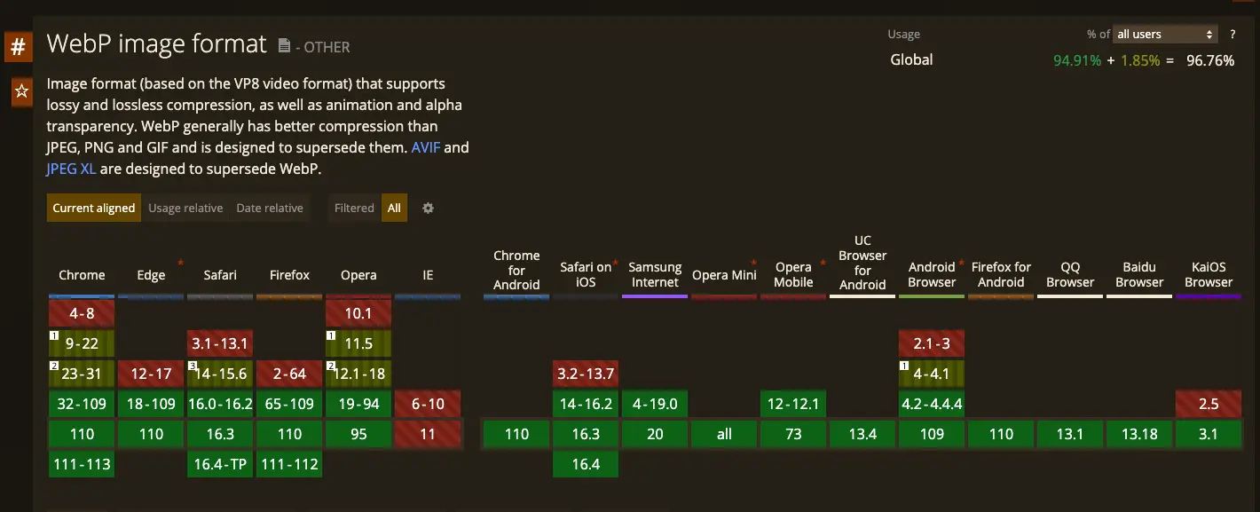
WebP
WebP is an image format developed by Google that is designed to provide high-quality images with smaller file sizes than other popular formats like JPEG and PNG.
WebP is supported by most modern web browsers, including Google Chrome, Firefox, and Microsoft Edge, as well as many image editing tools and content management systems. However, it may not be supported by all browsers, particularly older versions or those used on mobile devices.
While WebP is not yet as widely adopted as other image formats, it has gained popularity in recent years as a way to improve web performance and reduce page load times. Many websites have started to use WebP alongside other formats to provide the best possible experience for their users.
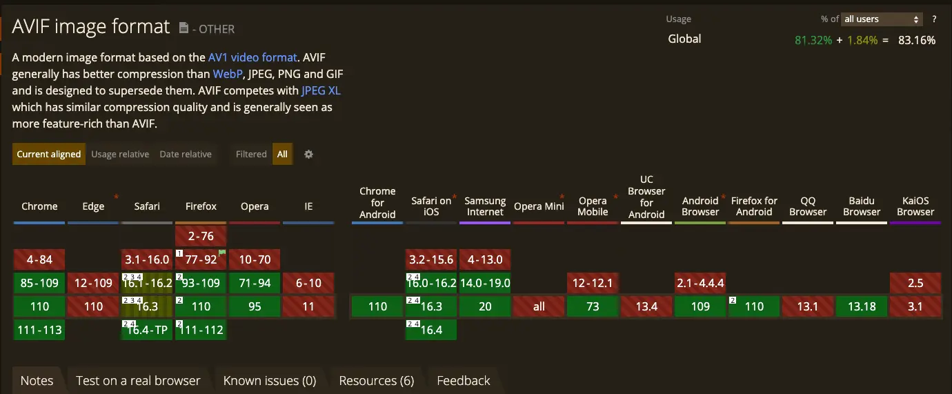
AVIF
AVIF (AV1 Image Format) is a relatively new image format that was developed by the Alliance for Open Media (AOM), a consortium of major tech companies including Google, Microsoft, and Apple. Like WebP, AVIF is designed to provide high-quality images with smaller file sizes than other popular formats like JPEG and PNG.
While AVIF is still a relatively new format and may not be supported by all browsers and image editing tools, it has gained traction in recent years as a way to further optimize image delivery on the web. Some web services, such as Netflix and Twitter, have already started using AVIF to improve the performance of their sites and apps.
Task
In our example we need to add fm=webp & fm=avif query params, however! We need to restructure our html to use a picture element. A picture element a a HTML 5 spec element which allows us to apply rules to which images can load based on whether a certain criteria is met. So for example if we want to use webp images we can do:
<picture class="c-masonry__grid-picture">
  <source srcset="https://plus.unsplash.com/premium_photo-1677756429788-8971a22b554e?ixlib=rb-4.0.3&ixid=MnwxMjA3fDB8MHxwaG90by1wYWdlfHx8fGVufDB8fHx8&q=70&fm=avif" type="image/avif" />
  <source srcset="https://plus.unsplash.com/premium_photo-1677756429788-8971a22b554e?ixlib=rb-4.0.3&ixid=MnwxMjA3fDB8MHxwaG90by1wYWdlfHx8fGVufDB8fHx8&q=70&fm=webp" type="image/webp" />
  <img
    src="https://plus.unsplash.com/premium_photo-1677756429788-8971a22b554e?ixlib=rb-4.0.3&ixid=MnwxMjA3fDB8MHxwaG90by1wYWdlfHx8fGVufDB8fHx8&q=70&fm=jpg"
    alt="Man with a load of plant pots" class="c-masonry__grid-image"
  />
</picture>
The example above tells us that if the browser supports on of these types, I want to load that image in over the one defined in the img tag.
Note: The if the top rule is met it will serve that one so when the browser supports both avif and webp, make sure avif is above webp in the markup.

10mb down!!! Next up, responsive images.
Responsive Images
Another important consideration is using responsive images that are optimized for different devices and screen sizes. This involves serving different image sizes and formats based on the user's device and network connection, which can help improve performance without sacrificing quality.
Task
In our example, we now have a picture element already in place. We need to add a new html attribute onto the source element which is known as media. Media works very similar to the way it works in css which is you set a breakpoint for the min-width and then the max width. The next thing we need to add is a new query param which is the &w=240&fit=clip (columns of 2 x 2 on 480px breakpoint) on the mobile version and then &w=480&fit=clip for our larger version.
We will be doing mobile first so we only need to include a min-width to our media query:
<picture class="c-masonry__grid-picture">
  <source srcset="https://plus.unsplash.com/premium_photo-1677756429788-8971a22b554e?ixlib=rb-4.0.3&ixid=MnwxMjA3fDB8MHxwaG90by1wYWdlfHx8fGVufDB8fHx8&q=70&fm=avif&w=480&fit=clip" type="image/avif" media="(min-width: 480px)" />
  <source srcset="https://plus.unsplash.com/premium_photo-1677756429788-8971a22b554e?ixlib=rb-4.0.3&ixid=MnwxMjA3fDB8MHxwaG90by1wYWdlfHx8fGVufDB8fHx8&q=70&fm=webp&w=480&fit=clip" type="image/webp" media="(min-width: 480px)" />
  <source srcset="https://plus.unsplash.com/premium_photo-1677756429788-8971a22b554e?ixlib=rb-4.0.3&ixid=MnwxMjA3fDB8MHxwaG90by1wYWdlfHx8fGVufDB8fHx8&q=70&fm=jpg&w=480&fit=clip" type="image/jpg" media="(min-width: 480px)" />


  <source srcset="https://plus.unsplash.com/premium_photo-1677756429788-8971a22b554e?ixlib=rb-4.0.3&ixid=MnwxMjA3fDB8MHxwaG90by1wYWdlfHx8fGVufDB8fHx8&q=70&fm=avif&w=240" type="image/avif" />
  <source srcset="https://plus.unsplash.com/premium_photo-1677756429788-8971a22b554e?ixlib=rb-4.0.3&ixid=MnwxMjA3fDB8MHxwaG90by1wYWdlfHx8fGVufDB8fHx8&q=70&fm=webp&w=240" type="image/webp" />
  <img
    src="https://plus.unsplash.com/premium_photo-1677756429788-8971a22b554e?ixlib=rb-4.0.3&ixid=MnwxMjA3fDB8MHxwaG90by1wYWdlfHx8fGVufDB8fHx8&q=70&fm=jpg&w=240"
    alt="Man with a load of plant pots" class="c-masonry__grid-image"
  />
</picture>
Tip: The way I tend to approach determining my image width for a breakpoint is by getting the width of the image at the next breakpoint. So for example, if I change the image at 480px width. I want to get the width of my image when it is at 480px so when the screen size shrinks to 375px, the quality remains in tact. You can do it the other way round and save some bandwidth however you are then stretching the image which may reduce the quality of the image for that breakpoint. It's very much preference...
Results
Destkop 587kb (~19.5mb)

Mobile 228kb (~19.8mb)

Note: Responsive images alone did not solve this, remember that without the w property on the CDN will cause the CDN to load the original image. This is purely to demonstrate the benefits to different sized images on different screen sizes.
Lazy-loading
So we could pretty much leave it there and we have solved the problem for our client, however the gallery is quite far down the page. Some customers might not even reach it and still have to load all those images in on the network which in return, uses up all their data. What if ... we could just load in the images when the customer scrolls down to the gallery? This is where lazy-loading comes into the mix.
Modern browsers can now do native lazy loading which is good for basic loading. If you need a more advanced solution, let's say you need to implement some animation on top or you want to control the threshold before you load the image, you can write your own using the intersection observer api or you can use a library called lazysizes (there are others out there).
For basic loading you can use a html attribute known as loading="lazy" on the img element and there you go. All browsers that support that feature will now lazy load the images in the gallery.
<img src="..." alt="..." loading="lazy" />Task
We could just implement the html attribute and be fine, but we want to add some extra quality to our images so it makes a more impactful statement when customers are scrolling through our images. What we need to do in our exercise page is this:
<picture class="c-masonry__grid-picture">
  <source data-srcset="...&q=70&fm=avif&w=480&fit=clip" type="image/avif" media="(min-width: 480px)" />
  <source data-srcset="...&q=70&fm=webp&w=480&fit=clip" type="image/webp" media="(min-width: 480px)" />
  <source data-srcset="...&q=70&fm=jpg&w=480&fit=clip" type="image/jpg" media="(min-width: 480px)" />

  <source data-srcset="...&q=70&fm=avif&w=240&fit=clip" type="image/avif" />
  <source data-srcset="...&q=70&fm=webp&w=240&fit=clip" type="image/webp" />
  <img
    data-src="...&q=70&fm=jpg&w=240&fit=clip"
    alt="..."
    class="c-masonry__grid-image lazyload"
    loading="lazy"
  />
</picture>
Can you see how the src and srcsets are now data attributes? We are telling lazysizes to change these to src/srcset when the image is near the threshold.
Note: When you use a tool that removes the src from an image. Just make sure you test your page from an SEO prospective. If you do have image issues you may need to provide a no script version of the html without the data attribute.
The result of the looks good, we have now reduced the page weight by a further 100kb.

Bonus - Perceived Performance
When we are requesting our images we see nothing and then all of a sudden, the page jumps around and our new image is there. The reason for the jumping is that we do not know the height of the image coming from unsplash so we cannot set an image aspect ratio. However, we can use perceived performance to help us fix both those problems.
There are two ways to show the customer that something is loading and that is by using a placeholder image. This could be as simple as a grey background using css which is good if you know the aspect ratio of the image or, we load a blurred image from unsplash which is very low in size and then lazy load the other image on top. What will happen here is that the aspect ratio will be already defined but the page will load really fast as those placeholder images are very small.
Task
Now we are going to add a background image to our picture element which will display a blurred version of the image and then we will follow along with the actual image. Because we are blurring the image the quality is going to be really unnoticeable when we make the image really small but stretch to meet the width of the page. For example:
<picture class="c-masonry__grid-picture" style="background: url('&blur=1550&q=70&fm=jpg&w=12&fit=clip')">
  <source data-srcset="...&q=70&fm=avif&w=480&fit=clip" type="image/avif" media="(min-width: 480px)" />
  <source data-srcset="...&q=70&fm=webp&w=480&fit=clip" type="image/webp" media="(min-width: 480px)" />
  <source data-srcset="...&q=70&fm=jpg&w=480&fit=clip" type="image/jpg" media="(min-width: 480px)" />

  <source data-srcset="...&q=70&fm=avif&w=240&fit=clip" type="image/avif" />
  <source data-srcset="...&q=70&fm=webp&w=240&fit=clip" type="image/webp" />
  <img
    data-src="...&q=70&fm=jpg&w=240&fit=clip"
    alt="..."
    class="c-masonry__grid-image lazyload"
    loading="lazy"
  />
</picture>
What you will notice in the browser is loading a few more images than usual but the page weight has not changed much as we are only loading in a 12px width image for each one.

Bonus - Add animation to native lazy-load
Finally when looking at our image go from the blurred version straight to our normal version it feels a little... janky. Let's use css to make this smoother. So our library lazysizes gives us class names to use that indicate the current lazy-loading state for our image. Let's copy and paste this into 03.css and just see what it does.
.lazyload,
.lazyloading {
	opacity: 0;
}
.lazyloaded {
	opacity: 1;
	transition: opacity 300ms;
}
Looks fancy right? How about we animate our blurred image from being "blurred" in css to normal.
.lazyload,
.lazyloading {
	opacity: 0;
  filter: blur(10px);
}

.lazyloaded {
	opacity: 1;
  filter: blur(0);
	transition: opacity 300ms, filter 300ms 300ms;
}
Looks a lot smoother yes? That is how you link a balance between good UX and a fast website when serving high quality images.