The Task
The client is really happy so far; however, they have mentioned that sometimes they can't see any fonts, and then the fonts flash on the page. Your browser determines how to paint the page based on your font face settings in the CSS. Let's discuss what each display pattern means.
Rendering Fonts
FOIT - flash of invisible text
FOIT (Flash of Invisible Text) occurs when the text on a website becomes invisible until the web fonts have loaded, and then they appear on the page. The text is ready to be rendered, but the browser doesn't know which font to use until it has loaded. Once the font is loaded, the browser "repaints" the screen and displays the new font, creating a visible "blink" effect.
FOUT - flash of unstyled text
To avoid this, one technique is to use FOUT (Flash of Unstyled Text), where some form of content is displayed on the page before the font loads, allowing users to quickly understand the message of the website without having to wait for the font to load.
Font Display Patterns
It depends on the case which pattern to use, but the most common one is FOUT. In the past, implementing this pattern was difficult because you had to load the font in via an AJAX request and then apply a CSS class on the HTML element, which then applied the font-family property. Thanks to CSS updating over time, we can now use a CSS property called font-display.
font-display is a CSS property that controls how a web font is displayed (or "rendered") while the web page is loading. It allows developers to specify how the text should be displayed while the web font is loading and what should happen once the font is loaded. The possible values are:
- auto : the browser will use its default strategy to display the font.
- block : the text will be invisible until the font has loaded, then it will be displayed.
- swap : the browser will display the fallback font immediately and swap it with the web font once it has loaded.
- fallback : the browser will display the fallback font until the web font has loaded, then it will be displayed.
- optional : the browser will use the web font if it's available, otherwise it will use the fallback font.
To apply it to our fonts, we need to add font-display to the font declarations in the exercise file:
/* /_site/_includes/exercises/02/index.njk */
@font-face {
  font-family: 'Rubik';
  src: url('/assets/fonts/woff2/Rubik/Rubik-Medium.woff2');
  font-weight: bold;
  font-style: normal;
  font-display: swap;
}
If you want to only wait a maximum of 3 seconds for a font to load then use font-display: fallback;. More info here.
Before vs after
Here is a Gif on how the fonts loaded before the change.
And here is how the font renders when using font-display: swap;.
Subsetting fonts
Font subsetting is a technique used in digital typography that involves creating a customized version of a font that includes only the characters needed for a particular document or website. This is done to reduce the file size of the font and make it load faster.
Creating a font that is subsetted
For this exercise we are going to change on the homepage the title copy Performance Kit which is using Monoton. This is a perfect example where FOUT would not quite work as the font is a display type font. We only need the characters to render the performance kit however we are loading in a full 34kb font file which isn't really needed.
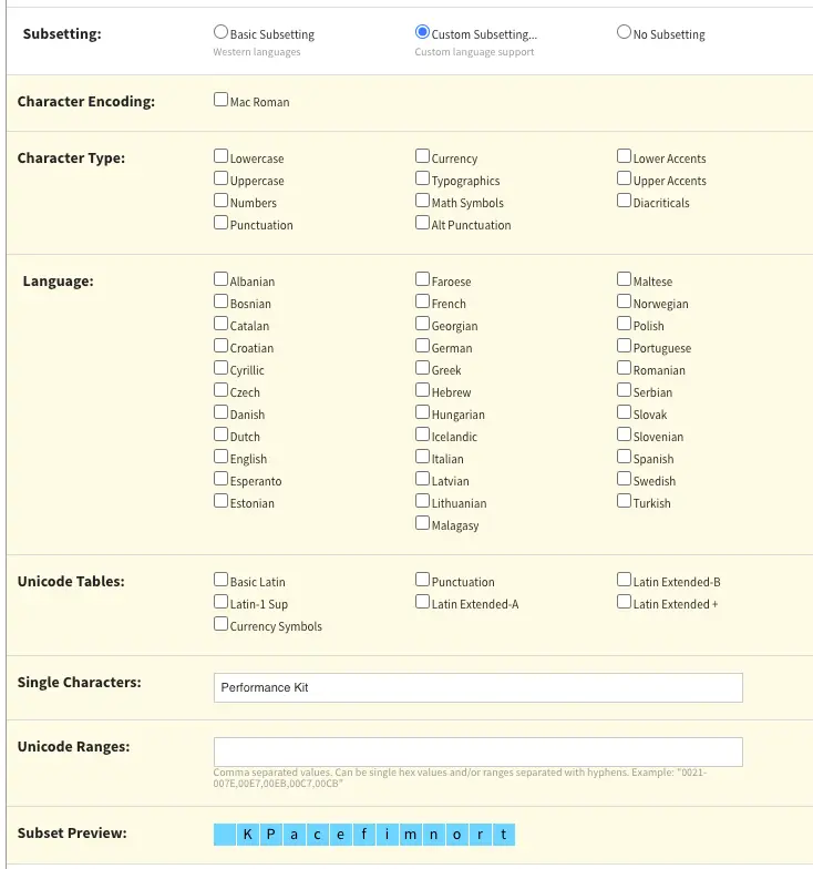
To be able to subset a font we need a tool that will do the work for us. Font Squirrel is a fonts website that has a web font generator which can help us subset the Monoton font family. Go to this link and upload the /_site/assets/fonts/ttf/Monoton/Monoton-Regular.ttf font file to the generator.
The next step is that you want to select "Expert" mode and then select "custom subsetting option". It should look like the image below.
Lastly lets replace the woff and woff2 versions of the monoton-regular files that are in the assets folder with our new fonts. You don't need to change the font declaration to be able to see this change.
The results
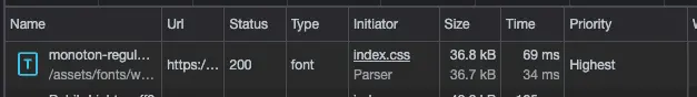
Now let's compare the two font sizes in the network tab. Before it was around 36kb just for those characters and now it is 4-5kb.
Before shot of the improvement to the fonts:
After shot of the improvement to the fonts:

By using only the characters that are actually needed, font subsetting helps to optimize the performance of digital documents and websites, making them load faster and reducing the amount of data that needs to be transferred. This can be especially important for mobile devices or low-bandwidth connections, where every byte of data counts.
Overall, font subsetting is a useful technique for optimizing digital typography and improving the user experience.
Variable fonts
Variable fonts are a relatively new type of font format that allow for more flexibility in typography by including multiple variations of a typeface within a single file. Each variable font can have multiple axis of variation, such as weight, width, slant, or optical size, allowing for a nearly infinite range of possibilities.
To better understand this, imagine a traditional font as a set of different fonts, each representing a specific weight or style. For example, a font family might include separate files for "bold," "italic," and "regular" variations of the same typeface. On the other hand, a variable font contains all these variations and more within a single file.
The task
In this part, we are going to be replacing the whole of the Rubik font declarations in favour of our new variable font. So to start that off we need to replace ALL of the font declarations defined in the exercise two layout and replace them with this:
 @font-face {
  font-family: "Rubik";
  font-display: swap;
  src: url("/assets/fonts/woff2/Rubik/Rubik-VariableFont_wght.woff2") format("woff2-variations");
  font-weight: 125 950;
  font-stretch: 75% 125%;
  font-style: normal;
}

@font-face {
  font-family: "Rubik";
  font-display: swap;
  src: url("/assets/fonts/woff2/Rubik/Rubik-Italic-VariableFont_wght.woff2") format("woff2-variations");
  font-weight: 125 950;
  font-stretch: 75% 125%;
  font-style: italic;
}
So in these font declarations you may see two new properties which are:
- font-weight: 125-950 - is a range of font weights this variable font can do
- font-stretch - the range in which the font can be stretched
These are defined when the variable font is created. Having these rules in the declaration just say use this variable font when the font weight of a p tag or any text element is within the range of 125-950.
Summary
The benefits of using variable fonts include a reduction in file size and more efficient use of web resources, which can lead to faster load times and improved performance. Additionally, designers can now adjust typography with greater precision, tailoring the font to the specific needs of a project, without needing to rely on a limited set of predetermined variations.
In summary, variable fonts are a new font format that offer greater flexibility and customization options for typography, all while being more efficient and streamlined than traditional font files.